Season 03 / 12 · spring · neutral warm · medium · bright
Bright Spring Color Palette
Also called Clear Spring — the same season under a different naming system.
Clear, warm, and electric — you were built for color other people are afraid of.
Bright Spring is the highest-clarity season in the warm half of the color wheel. Your coloring pairs a warm cast with genuine contrast: eyes that read unusually clear — bright blue, green, or sparkling brown — set against skin and hair that differ enough to create visible snap. That clarity is the whole game. Clear, saturated, warm-leaning color — bright coral, kelly green, clear turquoise, tomato red — meets your natural intensity and makes you look awake, healthy, and sharp. The classic Bright Spring mistake is dressing quietly: dusty roses, muted olives, and heathered grays drain the light from your face and make vivid coloring look tired. You do not need much color per outfit, but the color you use must be clean. When Bright Springs get it right, they look effortless in shades that would swallow anyone else, and that is a genuine wardrobe advantage.
How to recognize a Bright Spring
- Skin
- Warm or neutral-warm undertone with a fresh, clear quality; often golden or peachy; takes sun with a healthy glow
- Eyes
- The giveaway feature — bright, clear blue, green, turquoise, or sparkling warm brown, often with visible light in them
- Hair
- Golden blonde, warm medium brown, chestnut, or coppery brown — enough contrast against skin and eyes to create snap
- Contrast
- High for a spring — clarity between features matters more than sheer darkness
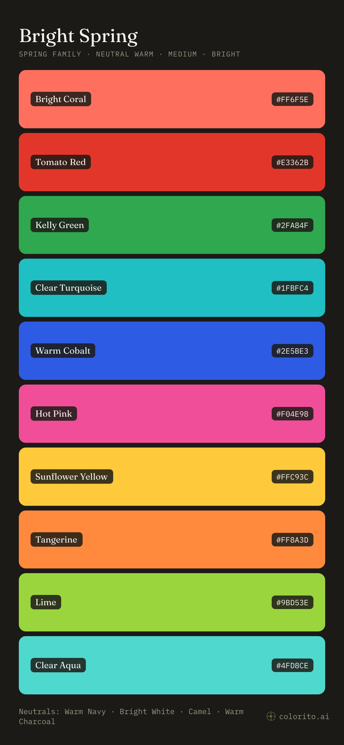
Your 10 power colors
Bright Coral
#FF6F5E
Tomato Red
#E3362B
Kelly Green
#2FA84F
Clear Turquoise
#1FBFC4
Warm Cobalt
#2E5BE3
Hot Pink
#F04E98
Sunflower Yellow
#FFC93C
Tangerine
#FF8A3D
Lime
#9BD53E
Clear Aqua
#4FD8CE
Colors that work against you
Dusty Rose
Muted, grayed color is your kryptonite — it flattens your clarity and makes bright eyes look dull
Heather Gray
Soft, hazy neutrals blur your natural contrast instead of framing it
Olive Drab
Murky, earthy shades pull your fresh warmth toward sallow
Burgundy
Too deep and too muted — it weighs down coloring that runs on light and clarity
Wardrobe neutrals
Warm Navy · Bright White · Camel · Warm Charcoal
Metals
Gold — polished and shiny over brushed or antiqued; keep hardware bright, never oxidized
What goes with your colors
Pairing guides for the colour families in the Bright Spring palette — each built from the twelve seasonal palettes, with the shade that is yours.
Take it with you
Your whole palette on one card — print it wallet-sized, set it as your lockscreen, or copy the hex codes for online shopping. All 12 palette cards →
Certificate of season
Bright Spring
Plate 03 / 12
colorito.ai/seasons/bright-spring
spring family · neutral warm · medium · bright
Your 10 power colors
Bright Coral
#FF6F5E
Tomato Red
#E3362B
Kelly Green
#2FA84F
Clear Turquoise
#1FBFC4
Warm Cobalt
#2E5BE3
Hot Pink
#F04E98
Sunflower Yellow
#FFC93C
Tangerine
#FF8A3D
Lime
#9BD53E
Clear Aqua
#4FD8CE
Neutrals
Warm Navy
Bright White
Camel
Warm Charcoal
Metals
Gold — polished and shiny over brushed or antiqued; keep hardware bright, never oxidized
Leave on the rack
Dusty Rose — Muted, grayed color is your kryptonite — it flattens your clarity and makes bright eyes look dull
Heather Gray — Soft, hazy neutrals blur your natural contrast instead of framing it
Olive Drab — Murky, earthy shades pull your fresh warmth toward sallow
Burgundy — Too deep and too muted — it weighs down coloring that runs on light and clarity
18 colors, not 40. The 40-color palettes are padding; these are the ones you'll actually buy. · From colorito.ai — take the 1-minute analysis to confirm your season.
Your lookbook
Bright Spring, on you
Four looks a month composed only from pieces in the Bright Spring palette, rendered onto your own photo, with two or three real products to buy for every piece. $19 a month, cancel anytime.
In menswear: Bright Spring menswear runs on clean neutrals with one vivid hit. Warm navy is your suit and outerwear anchor — sharper on you than charcoal or black. Bright white tees and shirts beat cream or ecru; the crispness matches your clarity. Then let a single saturated piece carry each outfit: a tomato-red knit, kelly polo, turquoise swim short, coral pocket square. Skip faded, washed, or garment-dyed fabrics — you want color that looks factory-fresh. Tan or cognac leather with polished gold hardware finishes it.
Not a subscriber yet? Start with four Bright Spring outfits, every piece buyable.
The rules, distilled
- 01One clear, saturated color per outfit against clean neutrals — never two brights fighting each other
- 02Choose bright white over cream, ivory, or off-white for shirts and tees
- 03Anchor tailoring and outerwear in warm navy instead of black or charcoal
- 04Buy colors that look freshly dyed — avoid anything described as washed, faded, dusty, or heathered
Is this you?
Find out in one minute
One photo or your Instagram, and the analyst tells you whether Bright Spring is actually your season — the verdict, your exact palette, and the colors working against you, saved to your account. $9, once.
Get your analysis — $9Often confused with
Bright Spring vs Bright Winter
Bright Winter shares your clarity but runs cool — if icy fuchsia and pure black look sharper on you than coral and warm navy, you sit on the winter side
Bright Spring vs Warm Spring
Warm Spring is more golden and lower contrast — it thrives in mellow apricot and honey tones, while you need cleaner, higher-voltage color to come alive
Bright Spring questions, answered
How do you know if you are a Bright Spring?
Skin: Warm or neutral-warm undertone with a fresh, clear quality; often golden or peachy; takes sun with a healthy glow. Eyes: The giveaway feature — bright, clear blue, green, turquoise, or sparkling warm brown, often with visible light in them. Hair: Golden blonde, warm medium brown, chestnut, or coppery brown — enough contrast against skin and eyes to create snap. Contrast: High for a spring — clarity between features matters more than sheer darkness.
What are the worst colors for Bright Spring?
Dusty Rose — Muted, grayed color is your kryptonite — it flattens your clarity and makes bright eyes look dull. Heather Gray — Soft, hazy neutrals blur your natural contrast instead of framing it. Olive Drab — Murky, earthy shades pull your fresh warmth toward sallow. Burgundy — Too deep and too muted — it weighs down coloring that runs on light and clarity.
What colors should a Bright Spring wear?
The Bright Spring color palette is Bright Coral, Tomato Red, Kelly Green, Clear Turquoise, Warm Cobalt, Hot Pink, Sunflower Yellow, Tangerine, Lime, Clear Aqua. Wardrobe neutrals: Warm Navy, Bright White, Camel, Warm Charcoal. Metals: Gold — polished and shiny over brushed or antiqued; keep hardware bright, never oxidized.